
Information Visualization in the Philosophical Transactions
This article is part of the volume Information and the History of Philosophy.
Introduction
A brief epigraph graced mathematician James Joseph Sylvester’s 1864 paper on the geometric curve they called ‘bicorne’:
Turns them to shapes and gives to airy nothing
A local habitation and a name.
(Sylvester 1864: 579)
Perhaps Sylvester merely invoked the Duke of Athens in a spirit of jolliness—their paper does not say. Yet they may also be conveying a core insight into the implications of the act of ‘turning to shapes’, or of visualising, as I will call it. Does, or can, visualising function as a fundamental shift, or does it for many authors amount to merely a difference of presentation?
In this chapter I will focus on information visualisation in one of the earliest scientific venues of scientific publishing—the one that also welcomed Sylvester’s paper in the 1860s—namely the Philosophical Transactions of the Royal Society, during the first two-and-a-half centuries of its operation. Specifically, I will consider how in this context the nature and function of the visualisation of information is conceived.
Section 2, ‘Journal visualisations’, will give you an overview of the basic characteristics of the Philosophical Transactions corpus and how visualisations occur therein. The next three sections delve into these questions for distinct type of visualisations: diagrams (section 3), maps (section 4) and graphs (section 5). Section 6, ‘Visualise for user performance’, then zooms out again to consider what, at a more general level, can be said about the nature and role of visualised scientific information in the earlier days of the Royal Society’s journal. Overall, I argue that by and large, visualisation here functions not to offer information of a distinct kind, but to optimise user (reader) performance.
Journal visualisations
Commencing in 1665, the journal Philosophical Transactions: Giving some Accompt of the Present Undertakings, Studies and Labours of the Ingenious in Many Considerable Parts of the World venue was among the first scientific circulars in Europe (the Paris-based Journal de Sçavans had started a few months prior). Initiator of the enterprise was scholar and diplomat Henry Oldenburg (1619–1677), then the Royal Society of London’s Secretary. Justifying his actions, Oldenburg introduced the first issue by noting that nothing was ‘more necessary for promoting the improvement of Philosophical Matters’ than the communication of studies, enterprises and discoveries among its practitioners (Oldenburg 1665: 1). Initially, this consisted of any scientific material that Oldenburg saw fit to print: extracts from correspondence, accounts of experiments and discoveries, or book reports.
It took nearly a century, until 1752, for the Society to formally (and financially) take over responsibility for the journal from its successive secretaries. (Moreover, the Society promptly introduced a rudimentary form of peer review, though not under that name (Fyfe 2015: 278), to curb the volume of items it published.) A little over a century later, after always having been run as a general platform, in 1887 the journal split into two specialist venues: Philosophical Transactions Part A (for physical sciences) and Part B (for biological and life sciences).
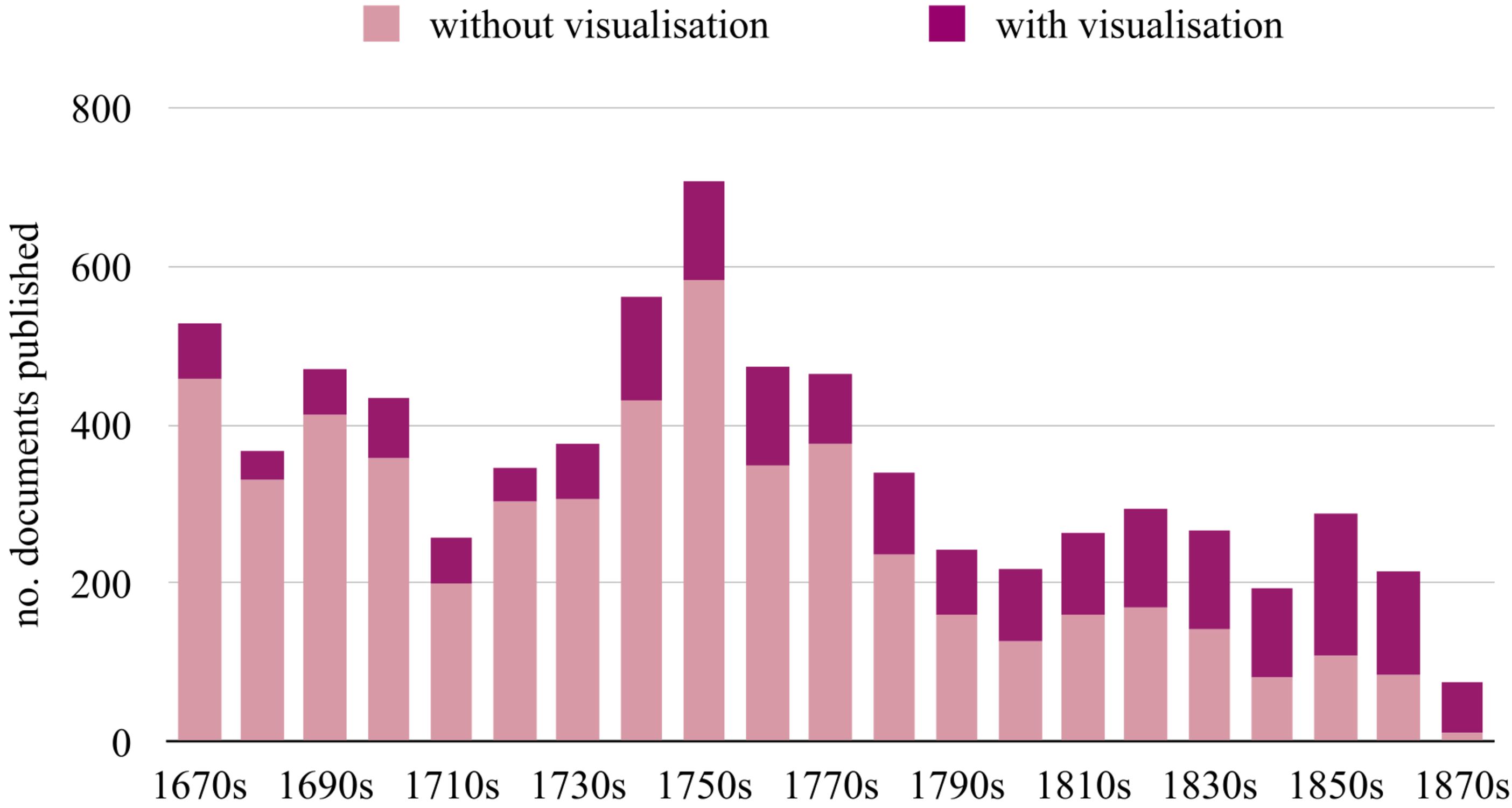
During its formative period, from 1665 to 1886 (inclusive), which I focus on here, I found 7,807 distinct published items. The number of distinct items published each decade peaks in the 1750s, then decreases (see Figure 10.1). Yet, as on average the documents printed got longer and longer, the average information quantity, measured in kB per document, on average goes up; meaning that the total quantity of information published over the years broadly continues to rise (Fyfe 2015; Meyns 2019).
What about visualisations that may or may not occur as part of the material published in the Transactions? That depends on what an information visualisation is. A visualisation, as I will understand it, is broadly: any representation which makes an object, situation, or information set visible (that is, accessible by sight), where this visibility is not exclusively text-based or narrative.
During the period studied here, a growing proportion of items published in the Transactions incorporates one or more visualisation, increasing from 13.23 per cent in the 1670s to 82.67 per cent in the 1870s.1 In total, out of the 7,807 documents published, I found that visualisations of one form or other occur in just over a quarter of documents (26.45 per cent, or 2,065 documents). Imaging techniques used include wood-cutting, mainly for simple figures, engraving for illustrations that require finer detail, and toward the end of the period also lithography, which facilitated printing in multiple colours.
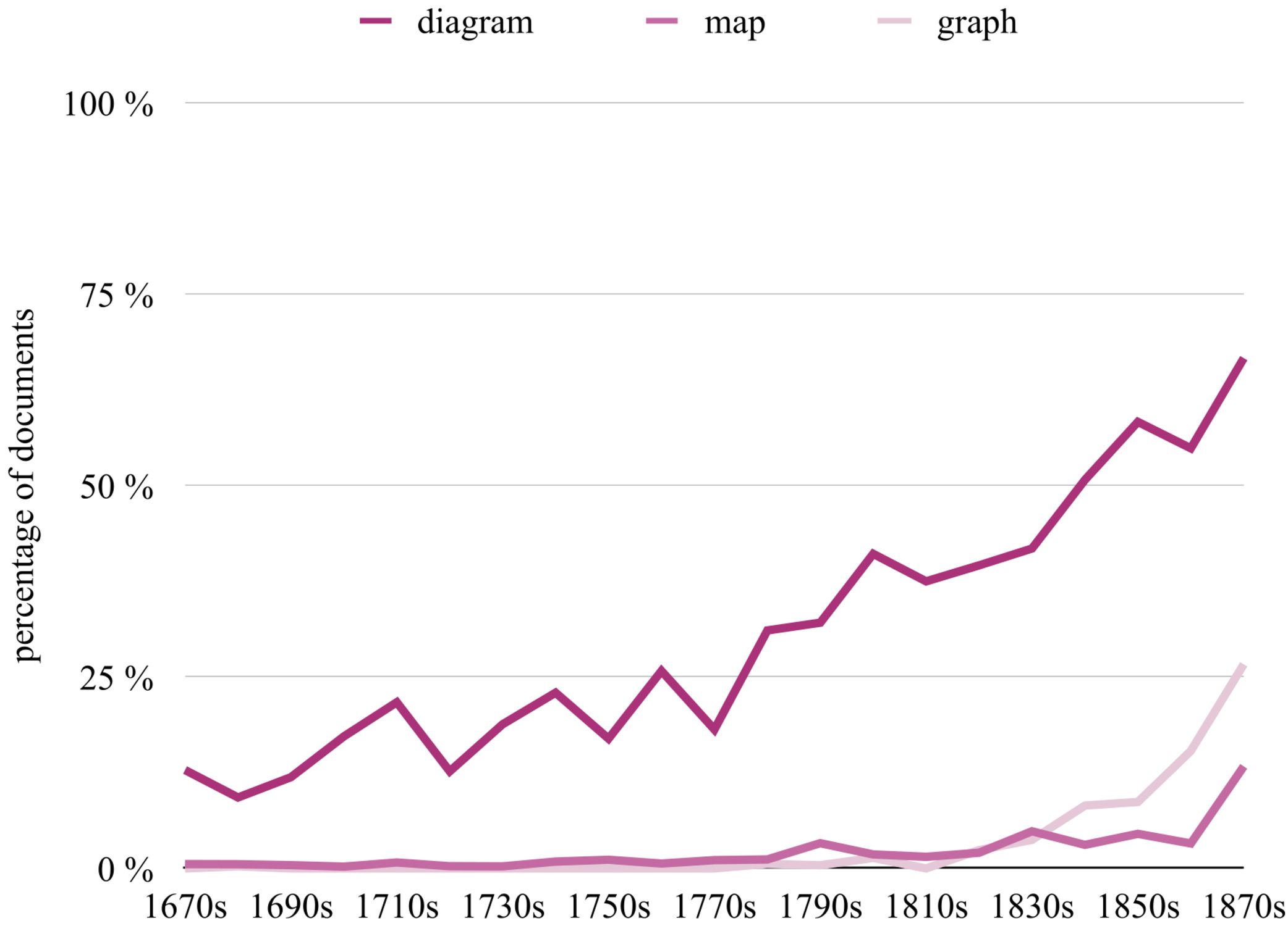
While there are myriad ways to classify visualisation types, here I will concentrate on three broad, familiar categories: diagrams (or ‘figures’), which are representations, often schematic, of the appearance, structure, or workings of something; maps, which are diagrammatic representations of the spatial arrangement or distribution of something over an area; and graphs (often called ‘charts’ or ‘curves’), namely diagrammatic representations of the relation between variable quantities. Hence, a diagram might document the layout of instrumentation used in an experiment, a map, the locations from which observations were conducted, and a graph may plot the measurements taken (as, for instance, in Benjamin Thompson’s 1781 study on gunpowder).
Diagrams make up by far the largest proportion of information visualisations found in the Transactions, occurring in around a quarter (25.08 per cent) of all published documents. Maps and graphs are much rarer overall, occurring in only 1.37 per cent and 1.81 per cent of all documents respectively, and they gain their foothold only later. While maps begin to rise somewhat earlier than graphs, around the 1790s, by the 1830s graphs have overtaken maps as the second most prominent type of information visualisation supplied in the journal (Figure 10.2).2 (Note that each document can contain multiple distinct visualisations, as well as visualisations of different types.)
A mark of the extent to which the use of visualisations grew, was that the journal’s production turned increasingly costly. By the 1820s the cost of publishing the Transactions could consume up to 50 per cent of the Society’s average annual income, with in some years the cost of engraving alone taking up around a sixth of its annual budget (nearly £600) (Fyfe, McDougall-Waters, and Moxham 2014: 16). (In the 1890s the Society’s Treasurer, John Evans, urged that the number of illustrations be reduced, and any plate costing more than £35 to produce would require special permission, as printing had become a drain on the Society’s resources (Fyfe 2015: 286).)
If visualisations were so costly, and so effortful to produce, what status and role did they play for the authors who insisted on including them with their publications? I will consider this question for diagrams first.
Diagrams
Diagrammatic visualisations are a staple of Philosophical Transactions publishing. Diagrams are included from the earliest volumes onwards. A growing literature on the history of scientific illustration has shown how, in the seventeenth century and beyond, images became standard elements in scientific practices, including in its communication in book publications and periodicals (e.g. Ford 1993; Baigrie 1996; Pauwels 2006; Burri and Dumit 2008; Kusukawa 2011, 2019; Moser 2014; Coopmans et al. 2014; Daston 2015; Bredekamp, Dünkel, and Schneider 2019). For the Royal Society, the likelihood of diagrams being present in papers steadily increases, with a marked expansion from the 1780s and throughout the nineteenth century. Not only would images accompany papers in print. In addition—as was common procedure around ‘curious’ objects and inventions—many drawings would already have been presented to, and scrutinised by, members the Fellowship at one of its meetings, reaching an (informal) ‘approval’ status on the reliability or authenticity of the depiction (Kusukawa 2011: 285, 288).
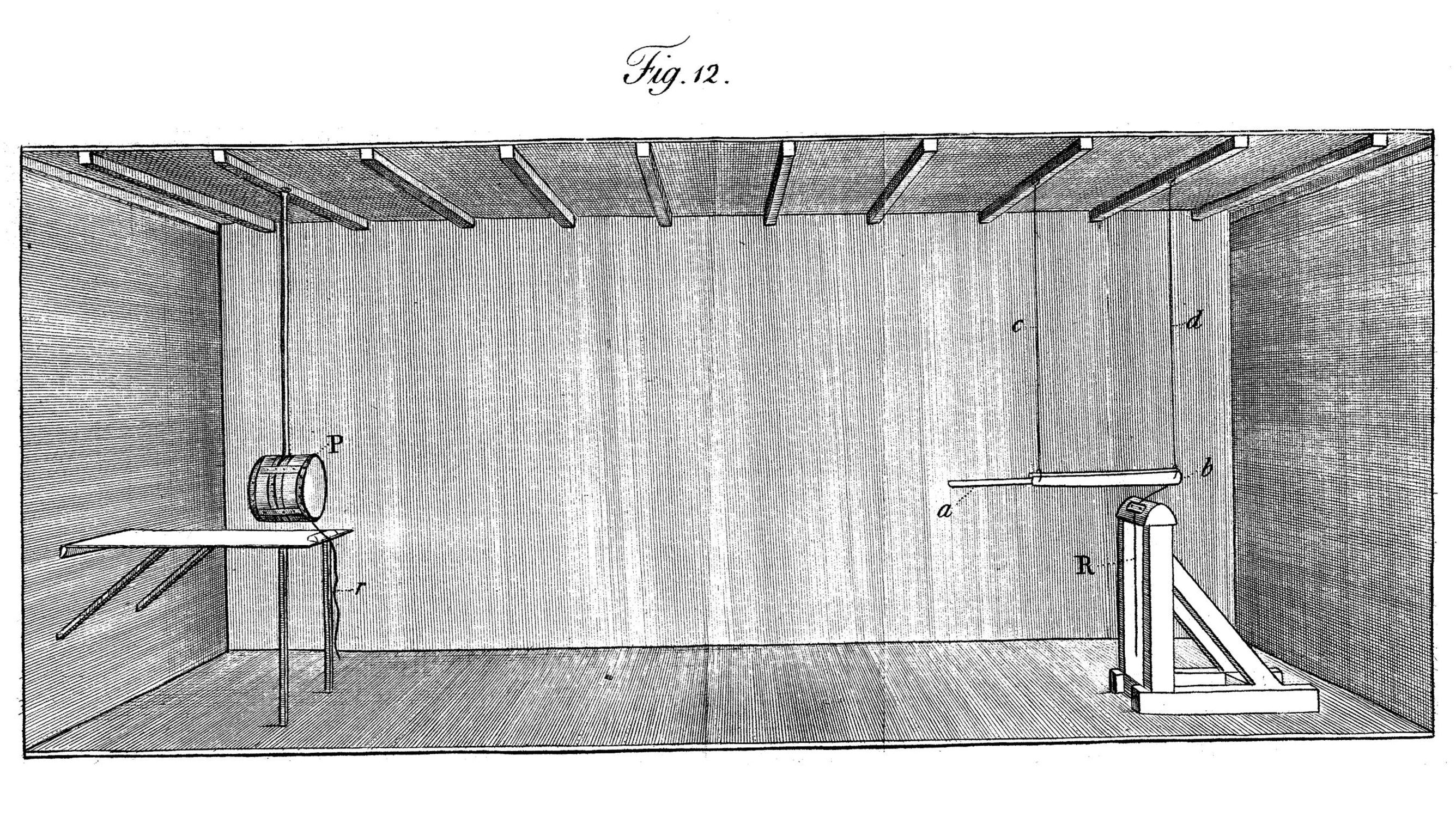
Where, or in what sort of papers, do diagrams appear in the Transactions corpus? In terms of themes and subject matter, diagrams are particularly prominent in papers that deal with topics in physics and engineering, and they can equally often be found in themes to do with biology or archaeology. For example, in papers reporting experiments, we can regularly find diagrams detailing experimental setup, or exhibiting the instruments used in the investigation. Such is the case for one of the earliest (set of) diagrams to appear in the Transactions, accompanying an article with guidance on how to make observations and do experiments at sea, published in 1666. It shows eight distinct instruments for taking physical measurements—including a ‘Dipping-needle’, a globe ‘to sound the deepest Seas’, and a ‘Glass Tube’ to find ‘different gravities of Water’—on a single plate (Moray and Rook 1666). Experimental setup diagrams can be seen, for instance, in one of the many studies on gunpowder that the journal published (Thompson 1781, Figure 10.3).
In the biological sciences, diagrams are regularly used to report on ‘curious’ species and their features, a testimony to which is Philip Carteret’s 1771 letter reporting on a ‘Camelopardalis’, today better known as the giraffe (Carteret 1771: 29). Archaeologists and exploratory travellers use diagrams to convey archaeological finds, such as coins (Garden and Plot 1685), ancient inscriptions (Swinton 1766) or fossils (Home 1818).
Certainly, though, not all diagrammatic visualisations are of the realistic, substitute-for-seeing format that the cases mentioned invite, and that they also display. Astronomer David Gregory’s diagram in support of a proof regarding properties of a type of curve named a ‘catenary’ (Gregory 1699) is a clear example, and there are many more. In fact, schematic, abstract geometric diagrams are quite common, especially in papers dealing with topics in mathematics, physics, or astronomy. (These diagrams often get embedded directly into the running text, building upon a tradition of visual language that had become conventional at least since the time of Euclid.)
A broad use of information visualisation in the form of diagrams, also found in the Transactions, is that they can show, exhibit, or in in short: make visible certain things—whatever it is that gets represented. For quite a number of the diagrams, authors take this for granted to such an extent that they comment little further upon their aim or purpose in including the scheme. A simple ‘see Figure’ or ‘Plate I’ is understood to suffice. Or, again common, they might comment that a certain object is ‘represented in the figure’ (Cat 1752: 324); ‘shown’ (Home 1818); that an image ‘exhibits’ or ‘gives’ certain details (Stokes 1862: 606, 608).
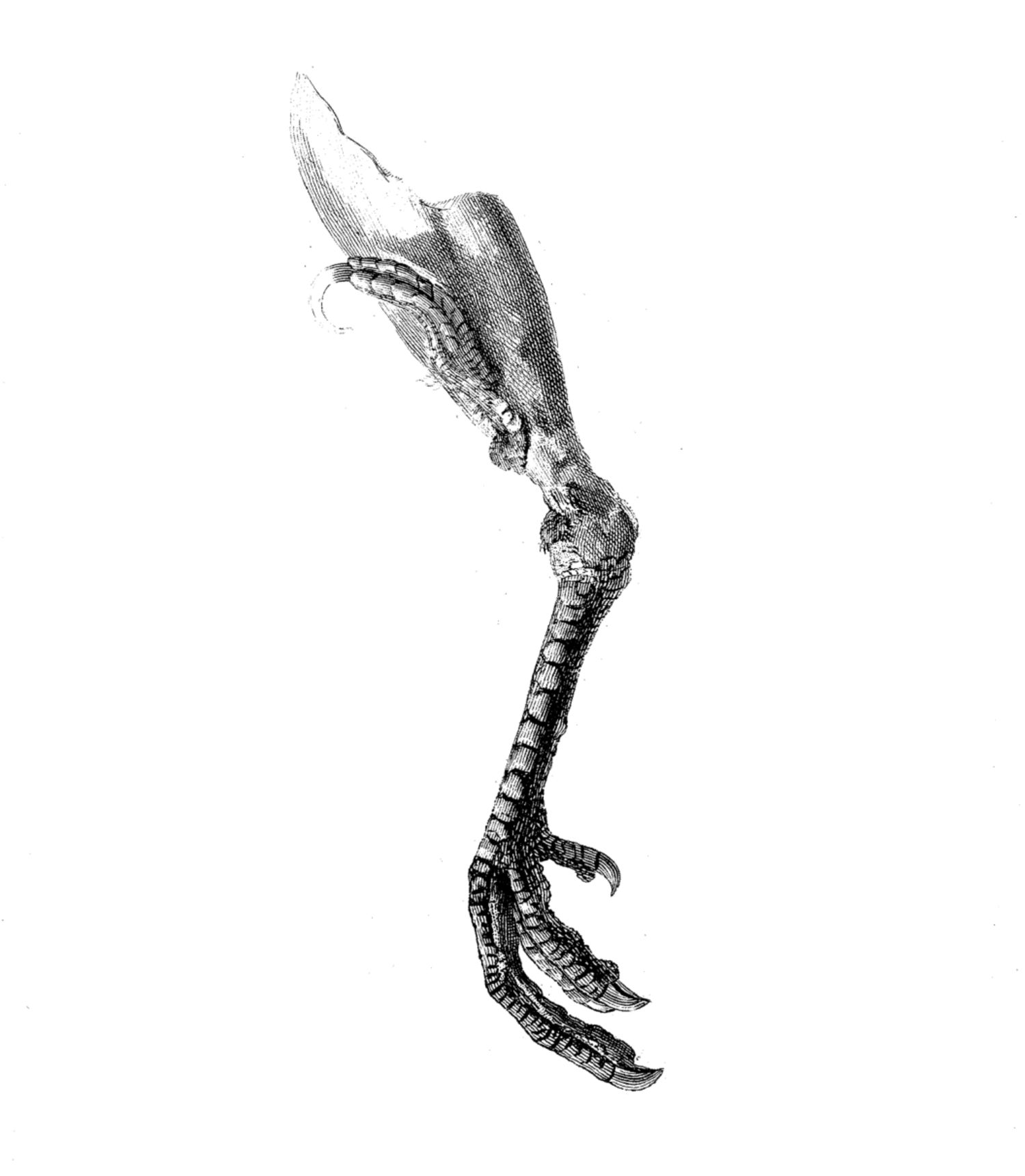
It is on a continuum with such remarks that, at some points, authors publishing in the journal get more specific on the type of information that a diagram might be thought to make available, namely when they comment on how a diagram is able to provide the form or appearance of something. For example, a paper detailing an instrument for astronomical observations notes: ‘The drawing accompanying this paper (Tab. XV.) will shew the general form of the instrument; and need very little explanation’ (Wollaston 1793: 136). Other papers refer to how their drawing ‘present[s] the curious with the following Form’ (Thomson 1673: 6097), or how the visualisation can help ‘to shew the form of the internal cavity’ (Home 1810: 189). Remarks about how an object’s ‘appearance’ can be conveyed through a diagram are not rare, either. Naturalist Thomas Pennant asks: ‘I beg leave to lay before you the very extra-ordinary appearance on the thigh of a Turkey’ (Pennant 1781: 81, Figure 10.4), while a paper on coral says one of its diagrams ‘shews the appearance of the tubes’ (Ellis 1757: 193).
Such comments point to diagrams fulfilling the role of providing not just any sort of information, but of them channelling information of a very specific sort: namely regarding the spatial, structural shape and appearance features of whatever is represented. That precisely this specific range or type of information is what diagrams provide, is yet underlined in how authors (for realistic work from nature, in any case) regularly comment on scale and sizing of items diagrammatically represented. They will note whether an item is shown ‘magnified’ or conversely in ‘Natural size’ (Ellis 1757: 193), from what angle something is shown (Westwood 1835: 327‒338), or may even provide a scale for the reader to determine dimensions (Brander 1755: 295).
In fact, expectations of accuracy rise to such an extent, that when a diagram has not represented everything proportionally, this must explicitly be flagged, as John Sackette does when identifying a ‘sinking of the Earth’ in Kent:
I hope Sir, you will understand the Situation of the Place pretty well, tho’ I have not observed exact Proportion in the Sketch; which the Paper would not allow after I have taken the Rise of the Cliffs so high, which I thought proper for the more particular Describing of them. (Sackette 1714: 470)
A step further, epistemically, is the thought that in certain instances, a diagram could epistemically function as a substitute for access to the thing represented itself. Sachiko Kusukawa describes this as the image as a form of ‘witness’, valued for its ability to contain, store and subsequently (re-) induce knowledge (instead of for its aesthetic assessment) (Kusukawa 2011: 288; 2019: 359).
Perhaps exemplifying such thoughts, authors may emphasize both the accuracy and the reliable source of the images adjoined to their articles. For example, authors may note they: ‘are enabled to give an accurate drawing of the apparatus’ (Allen and Pepys 1808: 250); that a depiction produced ‘with the greatest accuracy and minuteness’ the relevant nervous structures (Lee 1849: 47). Deducing accuracy from method of production, J. Lockhart Clarke points out:
The drawings have been executed by myself with the greatest care, and may be relied on as faithful and exact delineations of what was seen under the microscope. The outlines of all were taken by means of a camera lucida, in order to ensure correctness. (Clarke 1851: 608)
To enhance credibility, authors might flag that a drawing was made ‘from life’(Carteret 1771: 27), that they made it themselves or alternatively, who else they got it from; leaving a clear trail of accountability for the accuracy of the representation. (Perhaps surprisingly, engravers, those who translated scientists’ drawings to plates suited for mass-printing, were far less often credited, their names generally relegated to a quiet spot in the bottom right of a plate—‘J. Basire. Lith’.) (The Basire family regularly served the Royal Society in its image production since the 1770s (Fyfe, McDougall-Waters, and Moxham 2014: 16).)
Counter-intuitively, maybe, precisely when someone urges readers not to trust diagrams, these remarks indirectly affirm that such practice of trusting was expected and common. (If people need to be cautioned not to do something, that suggests that at least some people were doing precisely that thing.) Astronomer Charles Piazzi Smyth instructs readers not to rely too much on single sources (which, they thought, had led to confusion as to the appearance of Saturn):
A single drawing should not be looked on, by itself, as of importance in the present state of astronomy; for how can others than the artist prove the reality in nature of anything they may find in that one document, when this alone is before them? (Smyth 1858: 484)
Draughtspeople may (unconsciously) make mistakes. To make astronomical diagrams as trustworthy as ‘numerical observation’, we must eliminate errors in representation arising from individual people and instruments (Smyth 1858: 485) (and consider: Daston and Galison 1992, 2007).
This suggests that, as information visualisations, diagrams did to a certain extent function in the Philosophical Transactions as a source of spatio-structural and appearance information regarding their objects. Epistemically, authors (and, we may presume, their readers) do on occasion take them to as ‘stand-ins’ or witnesses to that object, and will employ various methods—such as emphasising accuracy, source, or method of production—to have the diagrams fulfil that information transfer function.
Maps
Information contained in map-based visualisations is bound always to involve some aspect of the organisation of elements in space—be it land, water, or the heavenly regions. Yet even within that broad characterisation, not all maps inform alike.
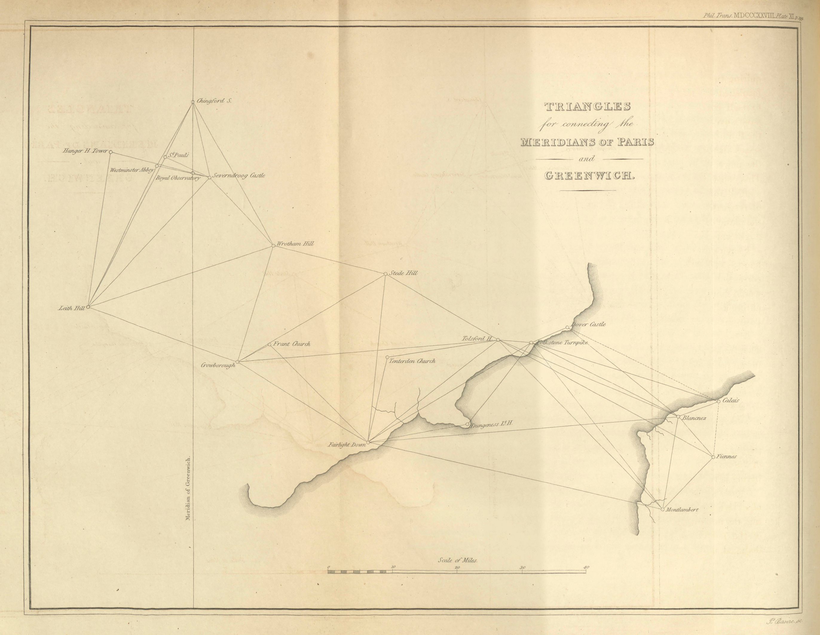
One category is the plain topological map documenting a region, instances of which begin to appear in the Transactions within the first decade of publication (for instance a map of mining locations in the Darthmore Hills in Devon (Anonymous 1671)). In particular up to the late eighteenth century, a good number of publications sets out to map (to them) lesser known terrains (such as a 1674 map of, among other locations, the island of Jesso—today’s Hokkaidō—near Japan (Rembrantz van Nierop 1674), or known terrains in greater detail. This includes many trigonometric surveys of parts of the British Isles and the European continent (see Figure 10.5), stimulated significantly by a succession of papers by major-general William Roy (1726–1790) and collaborators (whose campaigning eventually lead to the establishment of the Ordinance Survey of Great Britain) (Roy 1777: 788, 1785: 385, 1787, 1790).
As a sub-category of the basic topological maps we find ‘special interest’ maps, concentrating not so much on the geography itself, but on the location or distribution of a selective category of features in the mapped space. Examples of such maps in the journal include ones detailing the locations of archaeological finds of bones, fossils or inscriptions (Williams 1740; Boddington and Hunter 1771; Buckland 1822), or the maps produced by physicist John Goldingham of the locations at which where they carried out experiments measuring the velocity of sound (Goldingham 1823).
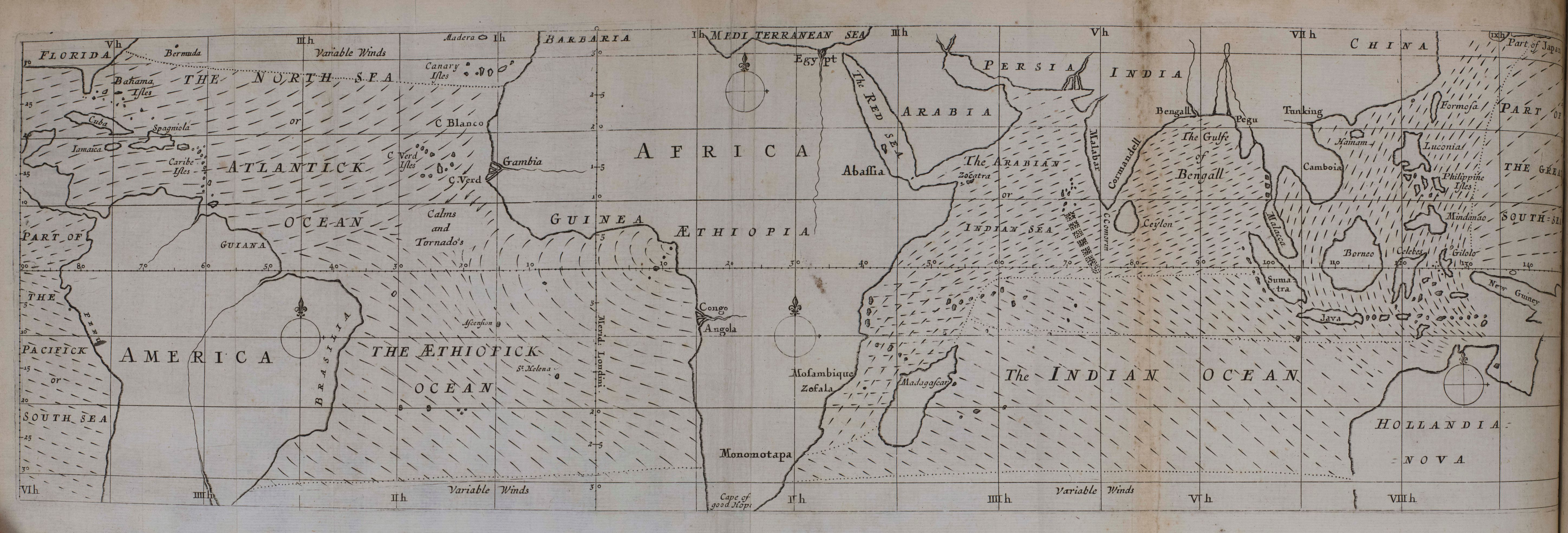
Yet information visualised in maps can be still further removed from showing rivers and towns when these maps start displaying the spatial distribution of quantitative information, be it physical quantities or other statistical information in so-called ‘thematic maps’ (Beniger and Robyn 1978: 2; Friendly and Palsky 2007: 208; Young, Valero-Mora, and Friendly 2011: 19). In fact, the first such map ever to be published appeared in the Philosophical Transactions, with Edmond Halley’s (1656–1742) ‘An Historical Account of the Trade Winds, and Monsoons, observable in the Seas between and near the Tropics, with an attempt to assign the Phisical cause of the said Winds’ of 1686 (Halley 1686). As the title indicates, this paper included a weather map, with dotted lines indicating the direction of ‘prevailing winds’ on a schema of the earth. Halley provided the map to aid the reader in grasping the conceptual move of tying ‘prevailing’ or average physical quantities to specific geographic regions (Figure 10.6):
To help the conception of the reader in a matter of so much difficulty, I believed it necessary to adjoyn a Scheme shewing at one view all the various Tracts and Courses of these Winds; whereby ’tis possible the thing may be better understood, than by any verbal description whatsoever. (Halley 1686: 162–163)
Information regarding physical quantities appears in the journal with some regularity over the following centuries, stimulated by enterprises of gathering vast amounts of data on these matters—in the guise of weather maps, or maps of magnetic declination in specific parts of the earth (Schlagintweit 1863; Evans 1872; Sabine 1872; Blanford 1874; Sabine 1875). Far less common in the Transactions is the mapping of statistical information relating to human affairs, such as demographic, economic, or transport data. Such information was increasingly being collected from the late eighteenth century onward, gathering speed in the early nineteenth century, but mostly as a state-related enterprise rather than by scientific societies (hence, etymologically, the label ‘statistics’), and it fell largely outside the inclination of the Society’s membership toward topics in the physical and biological sciences.
William Roy had deemed surveys to be ‘universally admitted to be works of great public utility’: useful for infrastructure maintenance in peacetime, a help in defending against enemy invasions during war (Roy 1785: 385). Was this also how map-based information visualisations function in the Royal Society’s journal?
As with diagrams, authors regularly flag that adjoined maps show a certain subject, for instance when they talk of a map that ‘shows’ a location (Martin 1806: 342ff); of geographies being ‘represented’ or ‘shewn’ (Farey 1811: 247, 253); or when they note that locations referred to ‘may also be seen in the Mapp here joyned’ (Rembrantz van Nierop 1674: 202; Goree 1710: 373). They equally regularly emphasise questions of sourcing: who drew the map, and where? (For instance, we find comments such as that a map was ‘the result of operations I have made on the spot’ (Pictet 1791: 110), or ‘drawn from a sketch made on the spot by Professor Buckland’ (Buckland 1822: 236, cf. Valvasor 1687: 412; Hamilton 1795: 92; Sabine 1843: 171; Sabine 1872: 357; Sabine 1875: 162)).
But there is far less, if any, emphasis on the information being made available concerning appearance or looks features, or of the map being a substitute or stand-in for seeing the actual thing. Rather, authors may often point to certain information having already been made available to the reader (a descriptions of a region, enumerations of locations), and remark that a map may simply help them grasp what has been said. For instance, the author contributing a 1671 report on Devon mines (only identified as ‘an Inquisitive person’) comments:
That this mysterious underground-way of working, may the easier and sooner be apprehended, be pleased to cast an eye on the annexed Scheme, in Tab. II … which may give some information to those that have not been conversant in Mines. (Anonymous 1671: 2102)
Others note that if the reader is willing to consult the map (to see where specific volcanic eruptions had happened), ‘it will add much to these Relations’ (Sloane, Alvarez de Toledo, and Morley 1694: 80), or that the sketch given in a map ‘will give some account of the particulars’ referred to (Pictet 1791: 107).
As one realises that, in many cases, people would not have been able to see the regions in question from a top-view or as a cross-section in the manner in which many of them were mapped, it is less surprising that the point of structural information transfer should be central, and not specific appearance features.
More strongly, while matters of sizing and scale are mentioned for diagrams as well as for maps, in the latter case the emphasis often falls on aspects of keeping just proportions and the projection chosen. (We can find comments on scale and projection in many articles, including: Foley and Molyneux 1694; Strachey 1724: 397‒398; Pictet 1791: 109; Hitchins 1801: 164; Frankland 1861: 673.)
Engineer and surveyor Henry Beighton (1687–1743), who had developed an instrument for map production, noted that in making a general map, one’s aim should be ‘to give the Form, Idea, and Proportion, that the Parts bear to the Whole, and one another’, and at such a scale that the whole fits on the intended sheet (Beighton 1740: 756). That Beighton further emphasises not only exactness, but also economy of design (that is, omit anything that is not essential to a plan of the area) (Beighton 1740: 751), signals that it is specifically structural elements, not specific looks, that are to be communicated through the use of maps.
Graphs
While ineliminable from scientific publications today, information visualisation in the form a graphic recording was not prominent in Philosophical Transactions from the outset. Such paucity in graphing during the first one-and-a-half centuries of the journal’s existence is not, as such, especially surprising when considered historically.
Graphing had simply only recently begun to make some conceptual and practical strides: conceiving of functions of the continuous variables of mathematics as graphable in geometric curves in a coordinate system had been conceptually available at least since René Descartes’s Géométrie (1637). Yet it would still be a further step to extend such practices to the graphic visualisation of observed physical variables; a practice which did not become commonplace until the eighteenth century (cf. Shields 1937: 68; Beniger and Robyn 1978: 2).
In the Transactions, graphs only begin to rise from the 1820s onward, with the increase becoming near unstoppable from the 1850s (at no point again decreasing during the period studied).3
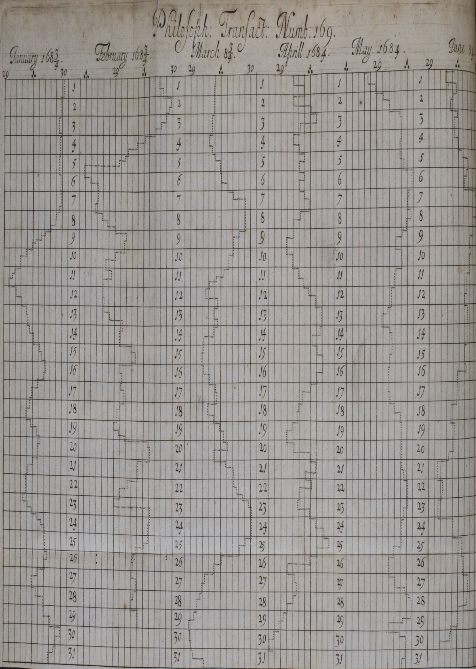
Where do graphs occur in the journal? Graphing is most common in subjects to do with physics and physical measurement, though they do also appear to a certain extent in papers in astronomy and chemistry. Common themes around which this form of information visualisation can occur in the Transactions are, indeed, in graphed barometer or thermometer readings to detail temperature or atmospheric pressure. In fact, the very first graph (or, more specifically, histogram) in the journal is one by naturalist Robert Plot, charting observations of ‘the rise and fall of the Mercury in the Barometer’ (Plot 1685: 930) (Figure 10.7). (In their work Plot used an instrument and template developed by Martin Lister, the use of which resulted semi-automatically in graphic output; a practice which, as Laura Tilling notes, was fairly common for graphic recording before the nineteenth century (Tilling 1975: 194).) Further prominent themes are registrations of terrestrial magnetism (such as in the work of Sabine 1851; Sabine, McClintock, and Maguire 1863; Airy 1863; Chambers and Chambers 1875), tide graphs (such as: Whewell 1836; Lubbock 1837; Haughton 1863), chemical analyses (Bunsen and Roscoe 1857; Crookes 1881), and quite some research on gunpowder (Thompson 1781, 1797).
That graphs come up in these fields, around this time, has, to an important extent, to do with an increase, in the seventeenth and eighteenth century, in the systematic collection of empirical data (regarding variables of time, distance, space, intensity, and the like) (Young, Valero-Mora, and Friendly 2011: 18–19). Often such registrations would be collected in tables. In fact, even some observations that were ‘born graphically’, so to say, with automated recording devices, would still be converted back to tabular format for scrutiny (Tilling 1975: 194). Indeed, we see that tables occur more frequently in the Transactions than graphs (or, for that matter, than diagrammatic or map-based forms of information visualisation). Authors regularly cross-reference their graphs with tables (noting, for instance, that ‘By means of these numbers the curve fig. 1 in Plate II. has been constructed’ (Airy 1843: 49), or that certain figures ‘represent graphically’ the ratios given in a table (Sabine, McClintock, and Maguire 1863: 654)). Moreover, in the journal, the inclusion of one or more graphs in a paper is also strongly predictive of inclusion of one or more tables: 90.78 per cent (128 of 141 documents) of papers with graphs also included one or more tables. (The converse was not the case: only 6,08 per cent of documents with tables contained one or more graphs.)
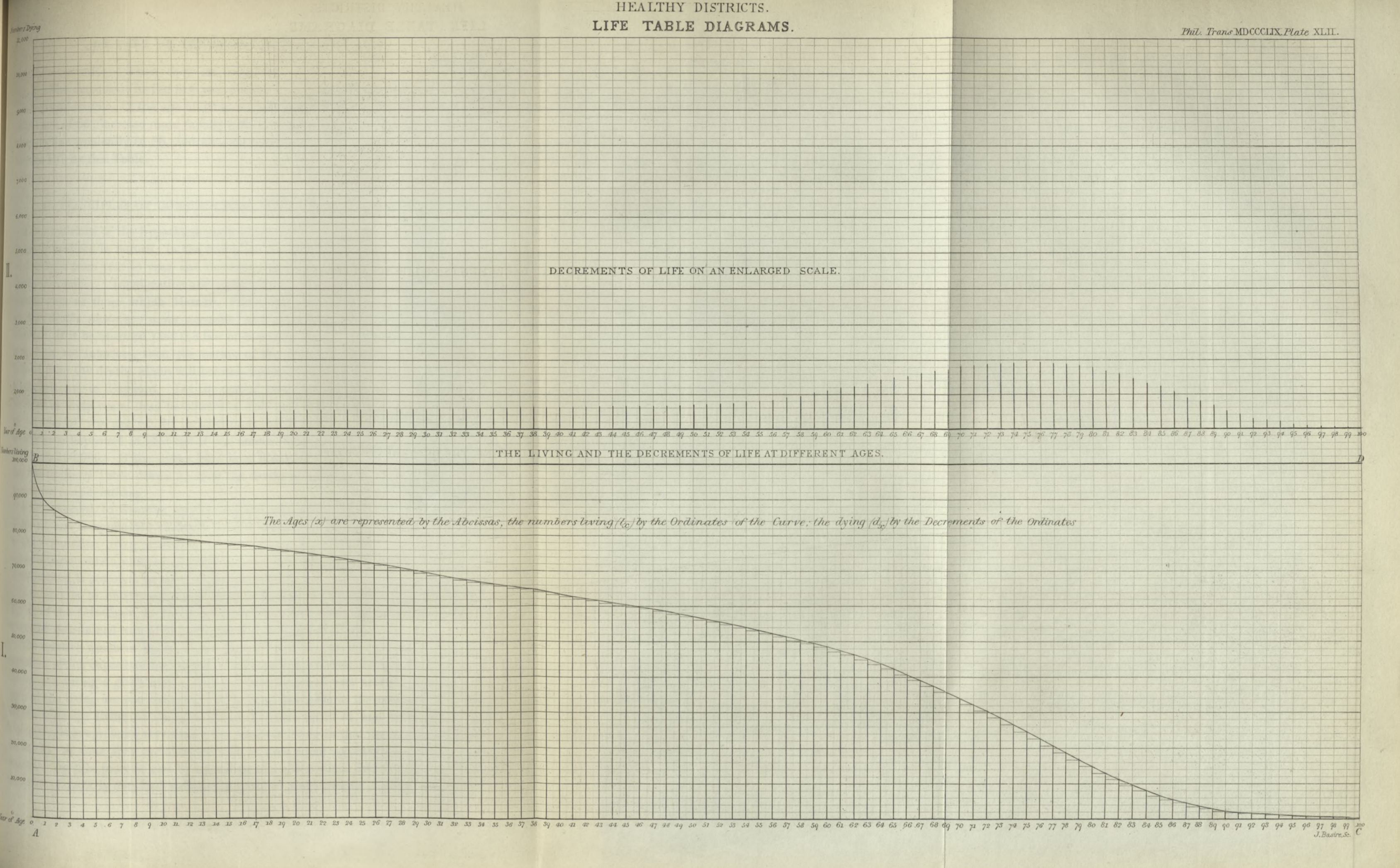
As with maps, we see fewer graphs associated with information concerning human affairs, such as demography or economics (be it wealth distributions, imports and exports, or transportation). One of the rare instances of a graph in the Transactions in this field is William Farr’s (1807–1883) article ‘On the Construction of Life-Tables, illustrated by a New Life-Table of the Healthy Districts of England’, published in 1859, in which Farr plotted both the ‘decrement of life’ (that is, numbers dying plotted against age, ranging 0 to 100) and the total number of people living at different ages (Farr 1859; Figure 10.8). It might not be a huge surprise to learn that Farr, in addition to their membership of the Royal Society, was also active at the UK General Register Office, where in 1800–1842 they worked on the UK Census, and hence had acquaintance with this demographic information.
While observational information may have been omnipresent in graphs, not all that was graphed in the journal concerned observations. Here I am not merely thinking of papers in, say, geometry that plot abstract mathematical functions (such as Sylvester’s 1864 graph of a ‘bicorn’). Also papers that do work with empirical information may regularly be found to plot theoretical or calculated values. For instance in a paper ‘On the Tides’, John William Lubbock graphs lines for both ‘Observations at the London and Liverpool Docks’ and for values ‘as deducted from Bernoulli’s Theory’ (Lubbock 1837). Moreover, authors regularly make use of practices of interpolation, where non-observed—calculated or estimated—intermediate values are inserted into a series; for instance Henry Enfield Roscoe comments of certain intensity tables that they ‘are obtained by careful graphical interpolation from the above numbers’ (Roscoe 1865: 613) (cf. Noble and Abel 1875: 113; Dixon 1884 :643). Hence, graphing practices in the Transactions were significantly, but not exclusively, tied to the gathering of observational information.
What role or function, then, does graphing fulfil in the journal? As with diagrams and maps, when authors comment on their graphs, they will often note in general terms that these can make certain information visible or accessible to the reader. For instance, they may explain a ‘curve’ (as the graphs are generally referred to) was added ‘For the purpose of exhibiting at one view the facts pointed out by these observations’ (Christie 1823: 352), or because, quite efficiently, ‘a glance at these curves show how closely the measurements made by the two methods agree’ (Roscoe 1865: 618–619). As physiologist Henry Newell Martin puts the rationale in a study of the effects of temperature on heart rate: ‘as curves present very quickly and accurately to the apprehension the general outcome of long columns of figures, charts have also been constructed’ (Martin 1883: 674).
The general assessment that graphs can ease the absorption of information was shared more widely among those using this form of visualisation in the period. Florence Nightingale—a member of the Statistical Society of London—explained that in their work they had graphed information for that exact purpose: ‘To make the figures which have been adopted in Tables I, II, and III more intelligible’ (Nightingale 1859: 6; viz. Brasseur 2005: 167), where William Playfair appreciated the efficiency of graphing, noting that while words or figures can take ‘some pains’ to impress onto memory, ‘It is different with a chart … what in the usual mode was attended with some difficulty, becomes not only easy, but as it were unavoidable’ (Playfair 1801: 6).
Yet at several points in the Transactions authors go beyond this, and appear to regard graphs as particularly suited to convey a specific type information: namely information regarding relations or laws. For instance, one may find remarks such as: ‘The curve drawn on Plate 13 … shows the relation’ between density and pressure in a gas (Noble and Abel 1875: 52), or: ‘That curves may be said to represent the relation’ between susceptibility to magnetisation and wire stress (Ewing 1885: 609). In a paper on combustion, chemist Edward Frankland boasts: ‘This uniformity of relation between pressure and luminosity will be more clearly seen from Plate XIX’ (Frankland 1861: 643).
Perhaps more remarkable is that some authors assert that graphs can directly show law-like relations, or laws. Engineer Jacob Perkins comments that they made a graph: ‘For the purpose of representing the law of condensation of water’ (Perkins 1826: 544). A study of the tides can include a graph titled ‘Curve representing the law of rise and fall of the tide at Southampton’ (Airy 1843); and in a chart of magnetic declination consisting of multiple graphed lines, some solid and some dotted, Charles Chambers and collaborator note that ‘the thick curves must be taken as best representing the true law’ (Chambers and Chambers 1875: 383).
These comments are not, we can suppose, loose talk. Royal Society Fellow William Whewell, who published regularly in the Transactions, motivates the law-capturing use of ‘the Method of Curves’ (as they called it) in their stand-alone publication Novum Organon Renovatum:
The Method may be used to detect the Laws which the observed quantities follow; and also when the Observations are inexact, it may be used to correct these Observations, so as to obtain data more true than the observed facts themselves. (Whewell 1858: 202)
Not only are graphs, in cases like these, understood to be able to directly exhibit a specific type of information—namely, concerning relations and laws—in addition, publications in the journal take graph-like information visualisations to fulfil a stronger epistemic function. Akin to how diagrams were, on occasion, thought to be able to function as (epistemic) substitutes for whatever they represented, some authors take graphs as themselves able to provide evidence, to demonstrate, or even to establish the truth of something.
Consider what astronomer and geophysicist Edward Sabine, who conducted many studies in terrestrial magnetism, notes on a chart of annual variation of magnetic declination: ‘On directing our attention to this Plate, it is perceived at the first glance, that the range of variation at all the stations is considerably greater during the hours of the day than during those of the night’ (Sabine 1851: 639). Commenting on a graph of the tides, Samuel Haughton remarks: ‘From an inspection of diagrams 1 and 2, Plate XII., it is plain that the conditions of the tide are different at New and Full Moon’ (Haughton 1863: 257). Perceiving that, and it being plain that, something is the case is factual; so in these circumstances, whatever is perceived or plain from the chart must at least be so. Hence, inspecting a graph can enable observation of facts.
Rarely does the exact attitude that attending to graphs can get one to facts, or even the truth, get expressed more clearly than in William Ramsay and Sydney Young’s statement, in their joint article on vapour-pressure, that: ‘On inspection of the curves representing the above numbers … the truth of Professor Thomson’s theory is evident’ (Ramsay and Young 1884: 467), or in John William Lubbock’s dry remark that ‘the diagrams in Plate II. appear to confirm the truth of this passage only at neap tides’ (referring to the included graph of tidal observations as a ‘diagram’) (Lubbock 1837: 100). More strongly, not irregularly the graphs themselves are referred to as fulfilling an evidential function. Lubbock, in that same article, extends their claims, showing themselves happy not only to state that certain things can be ‘evident from the diagrams’ (Lubbock 1837: 102), but also that some of their graphs are ‘confirming what is stated by Laplace in the Exposition du système du Monde’ (Lubbock 1837: 99). And compare William Crookes who, in a paper on radiation, notes of a curve with observational data and another with theoretical values, that: ‘The agreement is sufficiently close to prove that the force of radiation varies inversely with the square of the distance of the source’ (Crookes 1876: 336). These statements are testimony to how, for at least some authors publishing in the Philosophical Transactions, graphs can hold significant epistemic force: being able to prove, demonstrate, or show the truth of theses and views.
Visualise for user performance
Information visualisations in one of the first scientific journals during the first 231 years of its existence, we have seen, are by their producers understood, and used, directly for the purposes of communication. For all three forms of visualisations studied here—diagrams, maps, and graphs—we find authors emphasising how they ‘give’, ‘exhibit’ or allow certain features to ‘be seen’. But can anything be said about the wider functioning, overall?
In literature on information visualisation, we may distinguish two opposing stances on how the overall role of visualisation can be captured, diverging on whether information visualised could or could not also have been communicated to the reader by means other than through visualisation.
[exclusivity] Visualisations offer information that could not have been provided in a manner other than through visualisation.
Though they do not present it as a formal thesis, for instance the statement of Michael Friendly and Gilles Palsky: ‘Data and information visualization are fundamentally about showing quantitative and qualitative information so that a viewer can see patterns, trends, or anomalies, constancy or variation, in ways that other forms—text and tables—do not allow’ (Friendly and Palsky 2007: 208) could be interpreted as signally exclusivity. Non-exclusivity, it follows, must then be:
[non-exclusivity] Visualisations offer information that could have been provided in a manner other than through visualisation.
One could find a version of non-exclusivity with those who claim, as Colin Ware does (for the role of information visualisations today), that visualisations assist in accessing huge quantities of information more efficiently, in less time (Ware 2012: 3‒4): not the content, but the manner of delivering the content is what distinguishes visualisations.
What can be said about the position of visualisations in the Philosophical Transactions, on the basis of what has been discussed so far? (Of course I am here not concerned with identifying a uniform single ‘doctrine’ among all authors contributing to the journal across centuries, but rather with what one can call an institutional tendency or inclination in the journal.)
Occasional statements might be taken to point in the direction of the first option, exclusivity. Perhaps we consider Hans Sloane’s note that a map they report on ‘will add much’ (Sloane, Alvarez de Toledo, and Myorle 1694: 80) to what they had already said; Halley’s claim that with a ‘Scheme’ added, their point ‘may be better understood, than by any verbal description whatsoever’ (Halley 1686: 163), or James Dunlop’s suggestion that their drawings of a nebula (an outer space cloud of gas and dust) ‘convey a better idea of it than I could possibly hope to do by words’ (Dunlop 1828: 147). Does a visualisation’s exceeding verbal description not mean that certain types of information are exclusively visual, and communicable through visualisation?
I suggest that no such inference needs to follow for visualisations in the Transactions. This is because often a description of what is displayed on a map, or in a diagram or graph, is also given (this is the, from a certain point onward, ubiquitous ‘Explanation of the Plates’, which gets added at the end of papers). That signals that visualisation and description can illuminate the same subject matter, though in different guises. More strongly, for thematic maps and for graphs, numerical tables with measurements (or sometimes calculated values) are regularly included, too, and cross-referenced. Hence for that reason I suggest that, at least for the Royal Society’s journal, there is no reason to infer that what gets visualised must concern information of a distinct kind, exclusively suited to being transferred visually.
Instead, I propose that the use and function of information visualisations in the Philosophical Transactions is better understood as concerned with (what can be called) ‘user performance’. Visualisations in the journal help ‘user performance’, first of all, because the advantages authors often cite in including a diagram, map or graph are often performance related: they concern the speed, efficiency and convenience of using such a visualisation over the effort of having to offer (potentially elaborate) description. We witness Halley and Dunlop explicitly noting that their schemes convey things ‘better’ than words. And Whewell, in the same work cited earlier, praised the ‘efficacy’ of graphing, which he explained was due to ‘the faculty which the eye possesses, of readily detecting regularity and irregularity in forms’ (Whewell 1858: 202). (Performance features of visualisation are also regularly picked up in scholarly literature on the history of the subject matter, such as Tilling’s claim that a graph ‘may convey in a few seconds information that could only be gleaned from a table of measurements by hours of close study’ (Tilling 1975: 193), or Fienberg’s point that visualisations can provide access to information in summarised form (Fienberg 1979: 1); where such summary should be understood to increase efficiency.)
Second, I argue that the performance benefits of visualisations are best understood to lie on the part of the user of the visualisation. (Where ‘user’ should be understood as a relative or functional category: designating whoever consults the diagram, map or graph.) As Tilling notes, this can also include the original scientist who, say, glances at a graph to quickly check their data for outliers (Tilling 1975: 193). To understand this user-focus in the functioning of information visualisations, we would do well to recall the practical point, as has been laid out in section 2 on journal visualisations, that woodcuts, engravings and lithographs were comparatively costly to produce—a testimony to which is the Society’s Treasurer’s attempts to curtail the journals production costs. Including a visualisation would place an extra burden on the part of the author (who would generally produce the original drawings or sketches), the printer-illustrator (who would produce blocks or plates for mass-production), as well as on the journal’s owner-publisher (who would shoulder the additional cost of having visualisations printed), compared to setting regular type for printing narrative text.
On the producer side of the journal, adding visualisations to papers would come with additional effort. Yet for the user of the volumes of the journals, that is, those gaining information from the various papers, reports, and correspondence printed there, the information processing benefits can be expected to ensue. Hence, I conclude that in the Philosophical Transactions between 1665 and 1886, there is good indication that such visualisations of scientific information functioned in providing information in a manner that enhances user performance, or the user’s efficacy in accessing information.
Conclusion
Visualisations of scientific information occur with increasing frequency on the pages of the Philosophical Transactions during its early period as a generalist scientific journal, between 1665– 1886. During the early days, added schemes could sometimes be presented rather apologetically, as some frivolous add-on, ‘for the satisfaction of the Curious’ (Anonymous 1667: 487). However, when we take a broader view at how some of the core categories of visualisation are commented on in the journal—I considered diagrams, maps, and graphs—one gets a much sharper indication of how authors conceived the nature and function of information visualisation to operate in their printed work.
Here I have shown that, while all three categories of visualisation are, naturally, understood to ‘show’, ‘exhibit’or allow the reader to ‘see’certain information, the epistemic positioning can vary across the different formats. Diagrams are occasionally employed to function epistemically as a ‘stand-in’, substitute for, or witness to, whatever they represent. With maps, the emphasis is generally much more on the visualisation (often on large, fold-out formats) as a useful and trustworthy tool for planning and decision making. And not irregularly graphs are presented as fulfilling an enhanced epistemic role, of being able to prove, offer evidence, or even to confirm the truth of certain statements.
Stepping back, I have argued that there is no need to infer that authors publishing in the Transactions saw visualisations as being able to fulfil these functions in virtue of them providing access to a distinct, exclusive kind of information. Instead, we can see information visualisation in the journal as geared, broadly, toward aiding user performance: cumbersome and costly to produce, yes, but so much easier and efficient to work with on the part of the reader.
References
- Airy, George Biddell. 1843. ‘On the Laws of Individual Tides at Southampton and at Ipswich’. Philos. Trans. R. Soc. Lond. 133: 45–54. https://doi.org/10.1098/rstl.1843.0007.
- Airy, George Biddell. 1863. ‘On the Diurnal Inequalities of Terrestrial Magnetism’. Philos. Trans. R. Soc. Lond. 153: 309–16. https://doi.org/10.1098/rstl.1863.0013.
- Allen, William and William Hasledine Pepys. 1808. ‘On the Changes Produced in Atmospheric Air, and Oxygen Gas, Respiration’. Philos. Trans. R. Soc. Lond. 98: 249–81. https://doi.org/10.1098/ rstl.1808.0018.
- Anonymous. 1667. ‘Account of Athanasii Kircheri China Illustrata’. Philos. Trans. R. Soc. Lond. 2 (26): 484– 88. https://doi.org/10.1098/rstl.1666.0030.
- Anonymous. 1671. ‘An Accompt of Some Mineral Observations Touching the Mines of Cornwal and Devon’. Philos. Trans. R. Soc. Lond. 6 (69): 2096–113. https://doi.org/10.1098/rstl.1671.0004.
- Baigrie, Brian Scott. 1996. Picturing Knowledge: Historical and Philosophical Problems Concerning the Use of Art in Science. Toronto: University of Toronto Press.
- Beighton, Henry. 1740. ‘A New Plotting-Table for Taking Plans and Maps, in Surveying’. Philos. Trans. R. Soc. Lond. 41 (461): 747–61. https://doi.org/10.1098/rstl.1739.0131.
- Beniger, James R. and Dorothy L. Robyn. 1978. ‘Quantitative Graphics in Statistics’. The American Statistician 32 (1): 1–11. https://doi.org/10.1080/00031305.1978.10479235.
- Blanford, Henry Francis. 1874. ‘The Winds of Northern India’. Philos. Trans. R. Soc. Lond. 164: 563–653. https://doi.org/10.1098/rstl.1874.0017.
- Boddington, John and William Hunter. 1771. ‘Account of Some Bones Found in the Rock of Gibraltar’. Philos. Trans. R. Soc. Lond. 60: 414–16. https://doi.org/10.1098/rstl.1770.0037.
- Brander, Gustavus. 1755. ‘An Account of a Remarkable Echinus’. Philos. Trans. R. Soc. Lond. 49: 295–95. https://doi.org/10.1098/rstl.1755.0048.
- Brasseur, Lee. 2005. ‘Florence Nightingale’s Visual Rhetoric in the Rose Diagrams’. Technical Communication Quarterly 14 (2): 161–82. https://doi.org/10.1207/s15427625tcq1402_3.
- Bredekamp, Horst, Vera Dünkel, and Birgit Schneider. 2019. The Technical Image: A History of Styles in Scientific Imagery. Chicago: University of Chicago Press.
- Buckland, William. 1822. ‘Account of an Assemblage of Fossil Teeth and Bones’. Philos. Trans. R. Soc. Lond. 112: 171–236. https://doi.org/10.1098/rstl.1822.0017.
- Bunsen, Robert and Henry Enfield Roscoe. 1857. ‘Photo-Chemical Researches’. Philos. Trans. R. Soc. Lond. 147: 381–402. https://doi.org/10.1098/rstl.1857.0019.
- Burri, Regula Valérie and Joseph Dumit. 2008. ‘Social Studies of Scientific Imaging and Visualization’. The Handbook of Science and Technology Studies 297: 297–317.
- Carteret, Philip. 1771. ‘A Letter on a Camelopardalis Found about the Cape of Good Hope’. Philos. Trans. R. Soc. Lond. 60: 27–29. https://doi.org/10.1098/rstl.1770.0003.
- Cat, Claude Nicholas le. 1752. ‘A Letter from Mons Le Cat’. Philos. Trans. R. Soc. Lond. 47: 324–29. https://doi.org/10.1098/rstl.1751.0052.
- Chambers, Charles and F. Chambers. 1875. ‘On the Mathematical Expression of Observations of Complex Periodical Phenomena’. Philos. Trans. R. Soc. Lond. 165: 361–402. https://doi.org/10.1098/ rstl.1875.0014.
- Christie, Samuel Hunter. 1823. ‘On the Diurnal Deviations of the Horizontal Needle When under the Influence of Magnets’. Philos. Trans. R. Soc. Lond. 113: 342–92. https://doi.org/10.1098/rstl. 1823.0026.
- Clarke, Jacob Augustus Lockhart. 1851. ‘Researches into the Structure of the Spinal Chord’. Philos. Trans. R. Soc. Lond. 141: 607–21. https://doi.org/10.1098/rstl.1851.0029.
- Coopmans, Catelijne, Janet Vertesi, Michael E. Lynch, and Steve Woolgar. 2014. Representation in Scientific Practice Revisited. Cambridge, MA: MIT Press.
- Crookes, William. 1876. ‘On Repulsion Resulting from Radiation’. Philos. Trans. R. Soc. Lond. 166: 325– 76. https://doi.org/10.1098/rstl.1876.0013.
- Crookes, William. 1881. ‘On the Viscosity of Gases at High Exhaustions’. Philos. Trans. R. Soc. Lond. 172: 387–446. https://doi.org/10.1098/rstl.1881.0007.
- Daston, Lorraine and Peter Galison. 1992. ‘The Image of Objectivity’. Representations, 40: 81–128. Daston, Lorraine and Peter Galison. 2007. Objectivity. New York: Zone Books.
- Daston, Lorraine. 2015. ‘Epistemic Images’. In Vision and Its Instruments. Edited by A. Payne.
- Philadelphia: Pennsylvania State University Press, pp. 13–35.
- Dixon, Harold Baily. 1884. ‘Conditions of Chemical Change in Gases’. Philos. Trans. R. Soc. Lond. 175: 617–84. https://doi.org/10.1098/rstl.1884.0022.
- Dunlop, Jacob. 1828. ‘A Catalogue of Nebulæ and Clusters of Stars in the Southern Hemisphere’. Philos. Trans. R. Soc. Lond. 118: 113–51. https://doi.org/10.1098/rstl.1828.0010.
- Ellis, John. 1757. ‘An Account of a Red Coral from the East-Indies’. Philos. Trans. R. Soc. Lond. 50: 188–94. https://doi.org/10.1098/rstl.1757.0024.
- Evans, Frederick John Owen. 1872. ‘On the Present Amount of Westerly Magnetic Declination [Variation of the Compass] on the Coast of Great Britain’. Philos. Trans. R. Soc. Lond. 162: 319–30. https://doi.org/10.1098/rstl.1872.0014.
- Ewing, James Alfred. 1885. ‘Experimental Researches in Magnetism’. Philos. Trans. R. Soc. Lond. 176: 523–640. https://doi.org/10.1098/rstl.1885.0010.
- Farey, John. 1811. ‘An Account of the Great Derbyshire Denudation’. Philos. Trans. R. Soc. Lond. 101: 242–56. https://doi.org/10.1098/rstl.1811.0015.
- Farr, William. 1859. ‘On the Construction of Life-Tables’. Philos. Trans. R. Soc. Lond. 149: 837–78.https://doi.org/10.1098/rstl.1859.0034.
- Fienberg, Stephen E. 1979. ‘Graphical Methods in Statistics’. The American Statistician 33 (4): 165–78.https://doi.org/10.1080/00031305.1979.10482688.
- Foley, Sam and Thomas Molyneux. 1694. ‘An Account of the Giants Causeway in the North of Ireland’. Philos. Trans. R. Soc. Lond. 18 (212): 170–82. https://doi.org/10.1098/rstl.1694.0036.
- Ford, Brian J. 1993. Images of Science: A History of Scientific Illustration. Oxford: Oxford University Press. Frankland, Edward. 1861. ‘On the Influence of Atmospheric Pressure upon Some of the Phenomena of Combustion’. Philos. Trans. R. Soc. Lond. 151: 629–53. https://doi.org/10.1098/rstl.1861.0027.
- Friendly, Michael. 2008. ‘The Golden Age of Statistical Graphics’. Statistical Science 23 (4): 502–35.
- Friendly, Michael and Gilles Palsky. 2007. ‘Visualizing Nature and Society’. In Maps. Edited by James R. Akerman and Robert W. Karrow, 205–51. Chicago, IL: University of Chicago Press.
- Fyfe, Aileen. 2015. ‘Journals, Learned Societies and Money’. Notes and Records 69 (3): 277–299.
- Fyfe, Aileen, Julie McDougall-Waters, and Noah Joseph Moxham. 2014. ‘Philosophical Transactions: 350 Years of Publishing at the Royal Society (1665–2015)’. Report. University of St Andrews. http://hdl. handle.net/10023/6058
- Garden, George and Robert Plot. 1685. ‘Extracts of Two Letters’. Philos. Trans. R. Soc. Lond. 15 (175): 1148–58. https://doi.org/10.1098/rstl.1685.0060.
- Goldingham, John. 1823. ‘Experiments for Ascertaining the Velocity of Sound’. Philos. Trans. R. Soc. Lond. 113: 96–139. https://doi.org/10.1098/rstl.1823.0013.
- Goree, Pr. 1710. ‘A Relation of New Island’. Philos. Trans. R. Soc. Lond. 27 (332): 354–75. https://doi. org/10.1098/rstl.1710.0034.
- Gregory, David. 1699. ‘Responsio ad animadversionem ad Davidis Gregorii Catenariam’. Philos. Trans. R. Soc. Lond. 21 (259): 419–26. https://doi.org/10.1098/rstl.1699.0076.
- Halley, Edmond. 1686. ‘An Historical Account of the Trade Winds, and Monsoons, Observable in the Seas between and near the Tropicks’. Philos. Trans. R. Soc. Lond. 16 (183): 153–68. https://doi.org/ 10.1098/rstl.1686.0026.
- Hamilton, William. 1795. ‘An Account of the Late Eruption of Mount Vesuvius’. Philos. Trans. R. Soc. Lond. 85: 73–116. https://doi.org/10.1098/rstl.1795.0006.
- Haughton, Samuel. 1863. ‘On the Tides of the Arctic Seas’. Philos. Trans. R. Soc. Lond. 153: 243–72. https://doi.org/10.1098/rstl.1863.0011.
- Hitchins, Malachy. 1801. ‘Account of the Discovery of Silver in Herland Copper Mine’. Philos. Trans. R. Soc. Lond. 91: 159–64. https://doi.org/10.1098/rstl.1801.0010.
- Home, Everard. 1810. ‘On the Gizzards of Grazing Birds’. Philos. Trans. R. Soc. Lond. 100: 184–89. https://doi.org/10.1098/rstl.1810.0011.
- Home, Everard. 1818. ‘Additional Facts Respecting the Fossil Remains of an Animal’. Philos. Trans. R. Soc. Lond. 108: 24–32. https://doi.org/10.1098/rstl.1818.0005.
- Kusukawa, Sachiko. 2011. ‘Picturing Knowledge in the Early Royal Society’. Notes and Records 65 (3): 273–94. https://doi.org/10.1098/rsnr.2010.0094.
- Kusukawa, Sachiko. 2019. ‘The Early Royal Society and Visual Culture’. Perspectives on Science 27 (3): 350–94.
- Lee, Robert. 1849. ‘Postscript to a Paper “On the Ganglia and Nerves of the Heart”’. Philos. Trans. R. Soc. Lond. 139: 47–48. https://doi.org/10.1098/rstl.1849.0004.
- Lubbock, John William. 1837. ‘On the Tides’. Philos. Trans. R. Soc. Lond. 127: 97–140. https://doi.org/ 10.1098/rstl.1837.0011.
- Mallet, Robert. 1862. ‘Appendix to the Account of the Earthquake-Wave Experiments Made at Holyhead’. Philos. Trans. R. Soc. Lond. 152: 663–76. https://doi.org/10.1098/rstl.1862.0033.
- Martin, Edward. 1806. ‘Description of the Mineral Bason in the Counties of Monmouth, Glamorgan, Brecon, Carmarthen, and Pembroke’. Philos. Trans. R. Soc. Lond. 96: 342–47. https://doi.org/ 10.1098/rstl.1806.0019.
- Martin, Henry Newell. 1883. ‘The Direct Influence of Gradual Variations of Temperature upon the Rate of Beat of the Dog’s Heart’. Philos. Trans. R. Soc. Lond. 174: 663–88. https://doi.org/10.1098/ rstl.1883.0021.
- Meyns, Chris. 2019. ‘ “Data” in the Royal Society’s Philosophical Transactions, 1665–1886’. Notes and Records, 1–21. https://doi.org/10.1098/rsnr.2019.0024.
- Moray, R. and Mr. Rook. 1666. ‘Directions for Observations and Experiments to Be Made by Masters of Ships, Pilots, and Other Fit Persons in Their Sea-Voyages’. Philos. Trans. R. Soc. Lond. 2 (24): 433–48. https://doi.org/10.1098/rstl.1666.0009.
- Moser, Stephanie. 2014. ‘Making Expert Knowledge through the Image: Connections between Antiquarian and Early Modern Scientific Illustration’. Isis 105 (1): 58–99. https://doi.org/10.1086/ 675551.
- Nightingale, Florence. 1859. A Contribution to the Sanitary History of the British Army during the Late War with Russia. London: John W. Parker and Son.
- Noble, Andrew and Frederick Augustus Abel. 1875. ‘Researches on Explosives’. Philos. Trans. R. Soc. Lond. 165: 49–155. https://doi.org/10.1098/rstl.1875.0002.
- Oldenburg, Henry. 1665. ‘An Introduction to This Tract’. Philosophical Transactions of the Royal Society of London 1 (1): 1–2. https://doi.org/10.1098/rstl.1665.0002.
- Pauwels, Luc. 2006. Visual Cultures of Science: Rethinking Representational Practices in Knowledge Building and Science Communication. Lebanon, NH: University Press of New England.
- Pennant, Thomas. 1781. ‘An Account of the Turkey’. Philos. Trans. R. Soc. Lond. 71: 67–81. https://doi. org/10.1098/rstl.1781.0028.
- Perkins, Jacob. 1826. ‘On the Progressive Compression of Water by High Degrees of Force’. Philos. Trans. R. Soc. Lond. 116: 541–47. https://doi.org/10.1098/rstl.1826.0036.
- Pictet, Marc-Auguste. 1791. ‘Considerations on the Convenience of Measuring an Arch of the Meridian’. Philos. Trans. R. Soc. Lond. 81: 106–27. https://doi.org/10.1098/rstl.1791.0009.
- Playfair, William. 1801. The Statistical Breviary. London: J. Wallis.
- Plot, Robert. 1685. ‘A Letter from Dr. Robert Plot of Oxford’. Philos. Trans. R. Soc. Lond. 15 (169): 930– 43. https://doi.org/10.1098/rstl.1685.0022.
- Ramsay, William and Sydney Young. 1884. ‘Influence of Change of Condition from the Liquid to the Solid State on Vapour-Pressure’. Philos. Trans. R. Soc. Lond. 175: 461–78. https://doi.org/10.1098/ rstl.1884.0019.
- Rembrantz van Nierop, Dirick. 1674. ‘A Narrative of Some Observations Made upon Several Voyages’. Philos. Trans. R. Soc. Lond. 9 (109): 197–208. https://doi.org/10.1098/rstl.1674.0044.
- Roscoe, Henry Enfield. 1865. ‘On a Method of Meteorological Registration of the Chemical Action of Total Daylight’. Philos. Trans. R. Soc. Lond. 155: 605–31. https://doi.org/10.1098/rstl.1865.0012.
- Roy, William. 1777. ‘Experiments and Observations Made in Britain’. Philos. Trans. R. Soc. Lond. 67: 653– 787. https://doi.org/10.1098/rstl.1777.0035.
- Roy, William. 1785. ‘An Account of the Measurement of a Base on Hounslow-Heath’. Philos. Trans. R. Soc. Lond. 75: 385–480. https://doi.org/10.1098/rstl.1785.0024.
- Roy, William. 1787. ‘An Account of the Mode Proposed to Be Followed in Determining the Relative Situation of the Royal Observatories of Greenwich and Paris’. Philos. Trans. R. Soc. Lond. 77: 188–469. https://doi.org/10.1098/rstl.1787.0019.
- Roy, William. 1790. ‘An Account of the Trigonometrical Operation’. Philos. Trans. R. Soc. Lond. 80: 111– 614. https://doi.org/10.1098/rstl.1790.0015.
- Sabine, Edward. 1843. ‘Contributions to Terrestrial Magnetism—No. V’. Philos. Trans. R. Soc. Lond. 133: 145–231. https://doi.org/10.1098/rstl.1843.0011.
- Sabine, Edward. 1851. ‘On the Annual Variation of the Magnetic Declination’. Philos. Trans. R. Soc. Lond. 141: 635–41. https://doi.org/10.1098/rstl.1851.0032.
- Sabine, Edward. 1872. ‘Contributions to Terrestrial Magnetism—No. XIII’. Philos. Trans. R. Soc. Lond. 162: 353–433. https://doi.org/10.1098/rstl.1872.0016.
- Sabine, Edward. 1875. ‘Contributions to Terrestrial Magnetism—No. XIV’. Philos. Trans. R. Soc. Lond. 165: 161–203. https://doi.org/10.1098/rstl.1875.0004.
- Sabine, Edward, Francis Leopold McClintock, and Robert Maguire. 1863. ‘Results of Hourly Observations of the Magnetic Declination’. Philos. Trans. R. Soc. Lond. 153: 649–63. https://doi.org/ 10.1098/rstl.1863.0030.
- Sackette, John. 1714. ‘A Letter of the Reverend Mr. John Sackette’. Philos. Trans. R. Soc. Lond. 29 (349): 469–73. https://doi.org/10.1098/rstl.1714.0058.
- Schlagintweit, Hermann de. 1863. ‘Numerical Elements of Indian Meteorology’. Philos. Trans. R. Soc. Lond. 153: 525–42. https://doi.org/10.1098/rstl.1863.0025.
- Shields, Margaret C. 1937. ‘The Early History of Graphs in Physical Literature’. American Journal of Physics 5 (2): 68–71.
- Sloane, Hans, Pr. Alvarez de Toledo, and Christopher Love Morley. 1694. ‘A Letter from Hans Sloane’. Philos. Trans. R. Soc. Lond. 18 (209): 78–100. https://doi.org/10.1098/rstl.1694.0019.
- Smyth, Charles Piazzi. 1858. ‘Astronomical Experiment on the Peak of Teneriffe’. Philos. Trans. R. Soc. Lond. 148: 465–533. https://doi.org/10.1098/rstl.1858.0025.
- Stokes, George Gabriel. 1862. ‘On the Long Spectrum of Electric Light’. Philos. Trans. R. Soc. Lond. 152: 599–619. https://doi.org/10.1098/rstl.1862.0030.
- Strachey, John. 1724. ‘An Account of the Strata in Coal-Mines, &c’. Philos. Trans. R. Soc. Lond. 33 (391): 395–98. https://doi.org/10.1098/rstl.1724.0073.
- Swinton, John. 1766. ‘Remarks on the Palmyrene inscriptions at Teive’. Philos. Trans. R. Soc. Lond. 56: 4– 9. https://doi.org/10.1098/rstl.1766.0002.
- Sylvester, James Joseph. 1864. ‘Algebraical Researches’. Philos. Trans. R. Soc. Lond. 154: 579–666. https:// doi.org/10.1098/rstl.1864.0017.
- Thompson, Benjamin. 1781. ‘New Experiments upon Gun-Powder’. Philos. Trans. R. Soc. Lond. 71: 229– 328. https://doi.org/10.1098/rstl.1781.0039.
- Thompson, Benjamin. 1797. ‘Experiments to Determine the Force of Fired Gunpowder’. Philos. Trans. R. Soc. Lond. 87: 222–92. https://doi.org/10.1098/rstl.1797.0014.
- Thomson, William. 1673. ‘A Description of a Bee-House’. Philos. Trans. R. Soc. Lond. 8 (96): 6076–78. https://doi.org/10.1098/rstl.1673.0038.
- Tilling, Laura. 1975. ‘Early Experimental Graphs’. British Journal for the History of Science 8 (3): 193–213. https://doi.org/10.1017/S0007087400014229.
- Valvasor, Johann Weikhard von. 1687. ‘An Extract of a Letter’. Philos. Trans. R. Soc. Lond. 16 (191): 411– 27. https://doi.org/10.1098/rstl.1686.0074.
- Ware, Colin. 2012. Information Visualization. Waltham, MA: Elsevier.
- Westwood, J.O. 1835. ‘On the Supposed Existence of Metamorphoses in the Crustacea’. Philos. Trans. R. Soc. Lond. 125: 311–28. https://doi.org/10.1098/rstl.1835.0019.
- Whewell, William. 1858. Novum Organon Renovatum. London: J. W. Parker and son.
- Williams, Stephen. 1740. ‘An Attempt to Examine the Barrows in Cornwall’. Philos. Trans. R. Soc. Lond. 41 (458): 465–84. https://doi.org/10.1098/rstl.1739.0079.
- Wilkinson, Leland. 2013. The Grammar of Graphics. New York: Springer.
- Wollaston, Francis. 1793. ‘A Description of a Transit Circle’. Philos. Trans. R. Soc. Lond. 83: 133–53.https://doi.org/10.1098/rstl.1793.0013.
- Young, Forrest W., Pedro M. Valero-Mora, and Michael Friendly. 2011. Visual Statistics: Seeing Data with Dynamic Interactive Graphics. Hoboken, NJ: Wiley.
-
Here I work with the proportion of documents which include one or more visualisations, not an absolute number of distinct visualisations. This is because, in particular in the earlier years of the journal, liberties in printing can leave significant ambiguity over what should be counted as one single visualisation (figures are not always numbered, and are frequently bundled on a single “Plate”). ↩︎
-
For comparison: tables, understood as systematic displays of sets of facts or figures, often using columns, are yet more prevalent than any of these forms of information visualisation, occurring in 26.94 per cent of documents. I call tables an “in-between” category of visualisation, as they remain importantly text- or number-based, but clearly use spatial arrangement of visible features to communicate information. Scholarly literature features both those who do count tables as visualisations (such as Beniger and Robyn 1978: 1) and those who do not (such as Friendly 2008: 502). ↩︎
-
As M.C. Shields (Shields 1937: 69‒71) had already noted in an early study on the subject, during the period from circa 1780 to 1840, few graphs were published in scientific journals more generally. Where graphs occured, they were often restricted to charts of observations of physical quantities, such as barometer and thermometer readings, observations of the tides, rainfall, and terrestrial magnetism. ↩︎